Typography plays an essential role in the world of manga. When readers flip through their favorite manga series, it’s not just the art that captures their attention, but the way the text is presented.
The font choices used in manga, particularly in the speech bubbles and narration boxes, contribute significantly to the atmosphere and emotional impact of a story. In this article, we will explore the typography of manga, delve into the different types of fonts used, and understand why font choice is just as important as the artwork itself.
Understanding Manga Typography
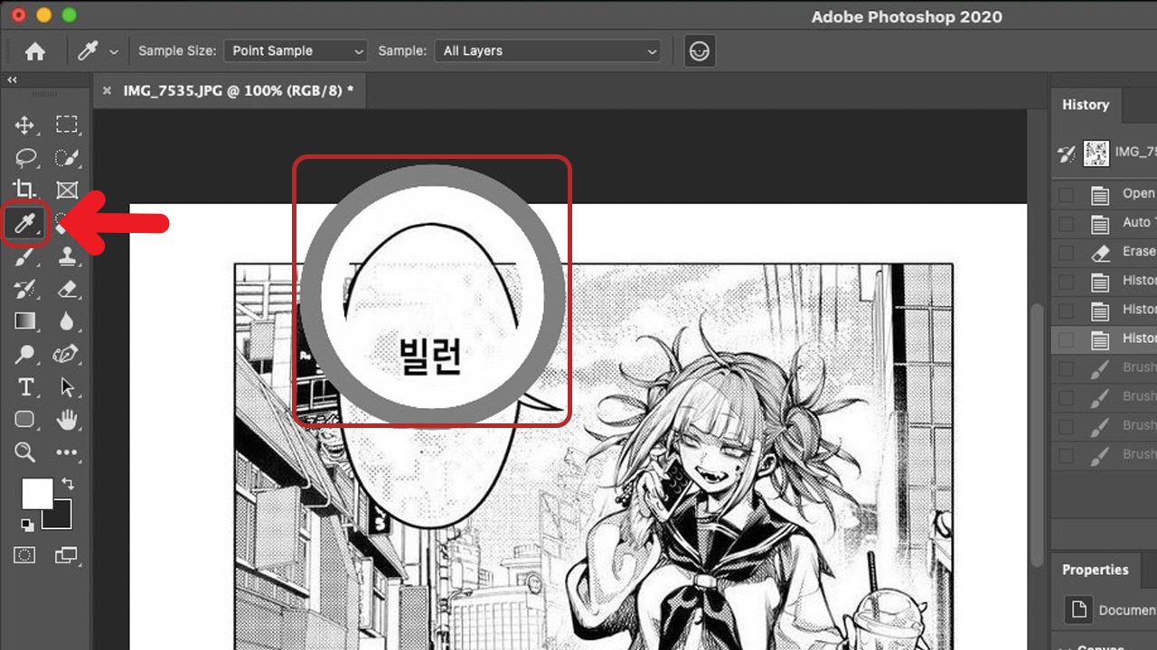
Typography refers to the style and appearance of printed or written text. In the context of manga, it is the design, size, and style of the characters and words that appear alongside the illustrations. Manga fonts are not just about readability—they also play a role in conveying tone, emotion, and context. Manga artists and letterers use fonts carefully to ensure that the text enhances the storytelling experience, and it complements the visuals effectively.
Manga fonts are generally classified into several categories based on their purpose and the type of speech or sound they represent. For example, dialogue often features one style of font, while sound effects might use a different, more stylized font to make them stand out.
The Basics of Manga Fonts
In manga, the text is typically divided into two main categories: dialogue and sound effects. Both categories utilize distinct font styles to ensure clarity and to enhance the overall reading experience. Let’s break down the most common font styles found in manga:
1. Dialogue Fonts
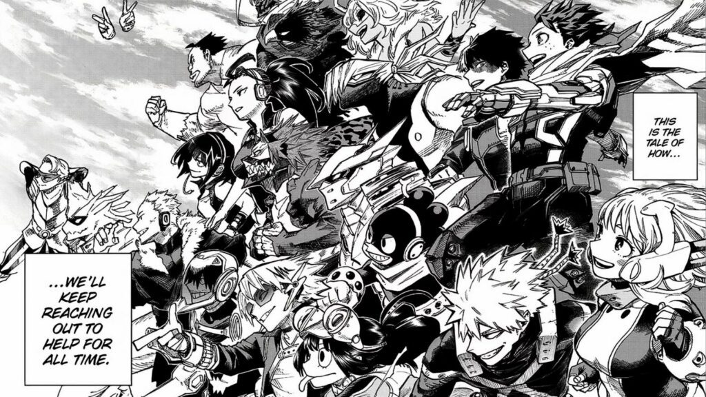
These fonts are used for spoken words, whether they’re in the form of a character’s speech or thoughts. Manga dialogue fonts are often sans-serif and clean to ensure readability. In most cases, the fonts are bold to draw attention to the conversation and maintain legibility.
For example, a well-known typeface often used in manga for dialogue is “Manga Temple”, which gives a clean and neutral feel to conversations. Another commonly used font is “Anime Ace”, which is simple but has a slight curve to it, making it more playful and fitting for certain character types.
2. Sound Effect Fonts
Sound effects in manga are more than just text—they are part of the artwork. These fonts can be highly stylized to match the sound they represent. For instance, a loud “BOOM” might be in a heavy, bold, and jagged font, while a soft “whisper” might appear in a delicate, thin font with light curves. The font size and orientation also change depending on the intensity of the sound.
Fonts for sound effects are designed to create an immersive experience for the reader. Popular examples include “Comix Heavy”, which is often used for action-packed scenes, and “Kaiju”, which is designed for large, monstrous sounds.
MangaKakalot and the Importance of Typography
MangaKakalot, a popular online platform for manga readers, is one of the best places to experience manga with high-quality fonts and typography. When browsing manga on MangaKakalot, the typography used contributes to the readability of the story, ensuring that readers can focus on the art while easily following the plot.
MangaKakalot typically features traditional manga fonts that retain the feel of the original Japanese publications. This commitment to maintaining original typography is a key reason why manga fans prefer using the site. The typography supports the immersive experience, allowing readers to enjoy the narrative as it was intended.
The Role of Typography in Emotional Impact
Manga artists use typography strategically to evoke emotions and enhance the overall storytelling experience. For instance, a simple, soft font might be used during a tender moment, while a loud, exaggerated font might highlight intense emotions such as anger or surprise. The size of the font can also convey urgency—larger, bolder fonts might indicate an urgent or dramatic situation.
Consider a scene where a character is shouting in anger. The font would likely be large and jagged, perhaps with additional effects like sparks or shaking letters to amplify the emotion. In contrast, a more subtle moment of reflection might involve a small, neat font with delicate strokes to signify calmness or introspection.
The Art of Choosing Fonts for Manga
Choosing the right font for a manga is a delicate art. The font must not only fit the tone of the scene but also align with the overall atmosphere of the story. For instance, a romance manga might feature softer fonts, while a horror manga might use jagged, sharp fonts to evoke fear.
Additionally, the artist must consider readability. Manga text is often translated into various languages, and the font choice plays a significant role in making the translation process smoother. Fonts that are too elaborate or stylized can sometimes hinder understanding, which is why simple and clear fonts are often preferred for general dialogue.
Fonts in Manhua
Manhua, which refers to Chinese comics similar to Japanese manga, often features distinct typography styles. While manhua fonts may share similarities with Japanese manga fonts, they often incorporate Chinese characters, which come with their own set of challenges when it comes to font design.
Manhua fonts are typically less stylized than their Japanese counterparts. This is because Chinese characters are more complex and contain more strokes, so a simpler, more legible font is necessary to prevent the text from overwhelming the art. However, just like in manga, sound effects and emotive text still use bold, stylized fonts to bring scenes to life.
Manhua also utilizes traditional brush-style fonts in some cases, especially for older or more historical series. These fonts replicate the calligraphy styles seen in ancient Chinese texts and contribute to the cultural feel of the story.
How Fonts Affect Manga Readability
While the visual aspect of the artwork is what attracts most readers to manga, the text itself is equally important in terms of readability. When a manga uses a clean, legible font, it helps readers focus on the storyline without being distracted by text that is difficult to read.
In some manga, especially older series, the fonts may appear small or cramped, which can hinder the reading experience. Modern manga often uses larger, more spaced-out text, making it easier to follow the dialogue and narrative. This trend has also been observed in the world of manhua, where legibility is often prioritized to ensure an enjoyable reading experience.

The Evolution of Manga Fonts
The typography of manga has evolved significantly over the years. In the early days of manga, fonts were hand-drawn by artists, often with inconsistent styles. Today, digital tools have made it possible to create fonts that are more consistent, polished, and easier to use.
Digital fonts allow manga creators to experiment with different styles while ensuring that the text remains legible across multiple platforms. Whether you’re reading manga on MangaKakalot or in print, the digitalization of typography has made it easier for both creators and readers to enjoy the medium.
The typography of manga is an often-overlooked yet crucial component of the reading experience. Fonts do much more than simply convey words—they help set the tone, evoke emotion, and enhance the visual storytelling that makes manga so compelling. Whether you’re enjoying your favorite manga on MangaKakalot or exploring manhua, understanding the role of typography adds a new layer of appreciation to this incredible art form.
Typography in manga, with its careful blend of style and function, ensures that each page is as engaging and readable as possible. From the dialogue to the sound effects, every aspect of the font contributes to the immersive world of manga. As the medium continues to evolve, so too will the fonts, making the typography of manga an exciting area to watch for years to come.


